
Semiotics In Brand Identity And Creative
A quick search of the word ‘semiotics’ online will unveil a giant library’s worth of scholarly articles and the various interpretations, understandings and examples of how humans and animals read them subconsciously. They’re all written by people much smarter, talented and better-looking than I, but for the purpose of this blog post we’re going to take a brief look at how semiotics is used in the development of brand identity and marketing.
The good news is smart creatives and marketers without any idea what it means, have probably been doing it all along without realising. Semiotics is the language of signs, symbols, gestures and behaviours as means of communication. Your mind reads signifiers (colour, shape, sound) and signifieds (the mental concept of knowing what you’re looking at through experience) and makes a decision which you follow/react with.
Confused? Here, take a look at the below ad…
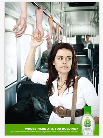
Without reading the copy “Whose Hand Are You Holding?” your mind has already noticed the bus, the human hands, the fact they’re not meant to be there, and the removed look on the lady’s face. You’d already made the decision this was an unhygienic scenario, right? Right!
The idea of your conscious/subconscious mind making decisions and altering bias etc is used in countless brand identities, marks and logos too.
Take a look at these icons, which use semiotic elements to convey a message:

The arrow in FedEx’s logo (the white space between the ‘E’ and the ‘X’ forms a perfect arrow) suggesting a company moving forward and looking ahead.

The arrow in amazon’s logo represents the idea that they carry everything from A to Z, and it’s also a smiley face.

The Tour De France logo has a cyclist in a racing position so that there can be no confusion as to what sport this is.

The London Symphony orchestra (LSO) logo is a conductor in action.
This great image shows the creative journey AirBnB went on to come up with its now unmistakeable logo – taking into account all aspects of the brand’s pillars and offering.

Semiotics is in everything and your mind is constantly reading it. Here’s a brilliant example of a floor ad in a shopping centre. It almost makes you feel itchy just looking at it.

Without the copy the brand could have just put a product bottle image and you’d have taken the exact same meaning simply seeing the scratch gesture by the dog and the people moving around it.
If semiotics is a topic you’d like to learn more on we suggest you take a look at the infographic below by The Independent which breaks it down into more detail than we have above. If you’re embarking on a campaign journey that entails creating a brand identity please do get in touch, our in-house creative team are experts at creating brand marks, logos, fonts, colour palettes, display and livery – and we’d love to show what we can do for you.
-GC