
Social Trackers: Valuable Asset or Presentation Filler?
Last week the good people of IPSOS MRBI released their updated research trackers on social networks and social messaging in Ireland. In digital marketing it’s a vital piece of survey information which shows the most current and complete comparison between the platforms, the audience consumption and helps inform those determining channel strategies in ‘Agencyland’. But is there anything in them to get really excited about or have they just become presentation filler?
Well, the answer is both yes and no. Personally, I love checking it and keep a watchful eye for its release. Not because I’m some soapbox preaching social media zealot, or that I think it’s “the gospel according to Zuck”, but because people have gone to the effort of creating a piece of relevant information that helps me paint a picture for prospective clients or brands, emphasis on the word “helps” here though. It’s simplistic in presentation – winner. It’s consistent – winner winner. It’s credible – winner winner chicken dinner.

TikTok climbing that league table - and Pinterest still trucking along, you love to see it!
However, too many times I’ve sat in meetings, conferences, presentations or brainstorms where the beautifully designed infographic was bandied around as profusely as the word “like” in a Corkonian’s language, like, with the preceding questions that lead there inevitably coming from a conversation around “maximising reach” or “engaged audience”, like. *Raises hands* I’ve been guilty of it myself in the distant past; over-egging the value of the insights to support my own ideal purpose for each platform, but not what I as a strategist should hang my campaign hat on. Important to note this is not the fault of IPSOS MRBI either, which has provided a brilliant and valuable service here. So, let’s look quickly at the ‘Pros+Cons’ of the trackers.
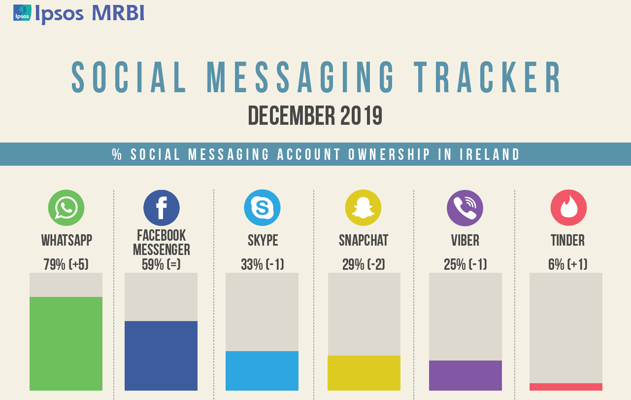
What’s this Tinder thing everyone is on about?……. …….. …… :P
Pros:
1) Measurement:
The infographics are a perfect starting point when you are discussing average daily usage of platforms, the amount of accounts owned, and the rise and fall of each platform over a period of time. Simply put; there are stats there that you will not have to hand without IPSOS MRBI’s work. If these top line figures are part of your narrative, then they’re a great asset to have.
2) Comparison:
You can clearly see from the research which platforms are in growth, stagnation or decline. If you go looking you can look back through the years and develop a timeline for each platform, seeing some platforms rise and fall (we miss Vine tbh) into nostalgic memories.
3) Identifying Platform Trends:
What we loved about the latest infographic was seeing the growth of TikTok, which mirrors the general news and view of the platform which has been flowing steadily into other platform feeds for some months now. Sometimes when you live in a digital media and marketing bubble you can be swept up in the PR buzz that permeates every online pore (remember Vero launched?!), but having a stat like this to back up the hype is an important weapon to have in your arsenal.

Careless Whisper? We miss you Vine!
Cons:
1) Relevance:
As noted, we hate when people base a channel strategy on the fact that there is an audience on each platform. When Facebook dipped two quarters in a row in 2009 and again 2013 people were sounding the death knell. Snore. If you truly understand your audience then the platform choice is dictated by their behaviours, not the number of accounts owned. Just because there are people who own the accounts doesn’t mean they’re all using them the exact same way to consume content or engage.
2) Skewed Results:
As marketers we’re always skeptical of the transparency of surveys. The case being the initial stats around “Messenger” when it was split from the main Facebook App showed huge numbers immediately, but you had to download it, so because people owned it and that’s how Facebook built the format, the numbers skewed high. Same went for Google+ many moons ago. We’re always amazed to see the number of Viber users included – are we missing something here or is it skewed by audience/handset or legacy?
3) Behaviours:
Too many people take the infographics literally and assume there is a homogenous behaviour on each platform. They assume that because you have an account you use it exactly the same as everyone else, which we all know to be incorrect and a sweeping generalisation. For example, some use Twitter for news, others to interact with celebrities, most to rage anger at their preferred sport/team or to scream political opinions into the online abyss. If you dig deeper the team in IPSOS MRBI will supply you with the info, but the deeper questions around platform behaviours cannot be answered in the posted trackers. Which platform is best for Lead Gen? Which supports sales best? These are the questions you should be asking yourself.

Remember building out your “circles” in Google+? Yeah, me either!
It’s up to the person who consumes and regurgitates these brilliant survey results to caveat their delivery without uninformed bias towards the top line figures shown on the infographics. In the past we’ve found the team in IPSOS MRBI superb to deal with and will shed light on any further detail needed on request (within reason obviously, don’t be a time thief) such as demographic breakdowns or past results comparisons. Importantly, you need to layer your channel strategy with more depth and research than - “there are people active there so we will go there too”. The stats are great, they’re a lovely way of informing part of the reason you’re picking a certain platform over another, but they are not a replacement for critical analysis of audience behaviours or good old innovation.
You can download the network and messaging tracker pdfs on the IPSOS MRBI website here.
-GC