
INTO THE (DESIGN) WEST
“IT’S ONLY A HORSE, TAYTO!”
We sent designer, Rita O’Brien to the wicky-wicky, wild, wild west to immerse herself in the rugged Connemara landscape as both a mode of research and source of creative inspiration. There she rubbed shoulders with world renowned designers while unplugging from hectic everyday working life —commuting, mobile phones, deadlines, media saturation and everything else. Here’s what she had to say about the two weeks of creative and design inspiration at “Design West”
What is “Design West”?
Design West is, by definition, a summer design school, for recent graduates and design professionals.
Set in Letterfrack, a cute, buzzy little village (one grocer, a hostel AND THREE PUBS!) in Connemara, for a duration of two weeks.
The course welcomes students and tutors from all over. As a result, the course is packed with various design disciplines, primarily graphic design, but also industrial/product design, interior design, print making and illustration, with a big focus on collaboration - learning and influencing one another. Taking in the landscape, enjoying excursions and experiencing the culture, the students, tutors and technicians develop thoughts and ideas from collective experimentation and observations.
Why you were there?
I was researching design courses primarily to develop conceptual and design thinking skills when a designer friend recommended I apply for Design West. Seeing the list of guest tutors got me really excited. Getting the chance to chat about their design practices and design processes was more than enough to entice me into applying. That and the opportunity to create and develop work under their guidance, wow!!
Also the fact that there would be lots of time spent immersed in nature – swimming, hiking (lots of hiking) and cycling – really sealed the deal for me… city life has made me appreciate what I didn’t as a kid/sulky teenager in the sticks!

What were your tasks?
Six design briefs were shared with all the participants prior to the course itself. The briefs acted as guidelines or starting points to ideas that could be developed throughout the course.
Initial research was carried out in order to pick a brief of preference. I had managed to narrow it down to all three… yes decisiveness is not one of my strong points, but have definitely noticed a change since finishing the course.
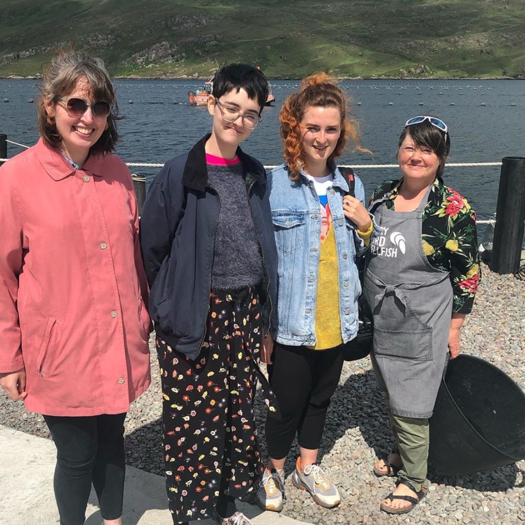
There were really helpful webinars packed with information about the course itinerary. Day trips – like visiting Killary Harbour, tasting oysters at Killary Fjord Shellfish and getting a crash course in mussel farming – didn’t just lead inspiration to just one particular brief – like the re-imagining of the Killary Fjord Shellfish packaging, but definitely benefited everyone involved.
From simply chatting to Kate, one of the Shellfish company owners, I gathered knowledge around the meanings behind local place names – another brief asked to explore the origins of traditional Irish place names in the Connemara area. Coming away with what the locals call the villages and areas, in particular “frack” for Letterfrack, edged me towards developing Brief 6; “Create a unique visual identity for GMIT Letterfrack” (the furniture design college), where we were based for the two weeks.
The brief asked for an identity to be fully developed, rather than diving straight in with a logotype, but to consider making a piece that essentially grasps the what the institute is about. So after a bit more research and group discussions and experimenting with twigs, cement, leaves, carving knives, wire, seaweed and anything that caught my interest along the way, off I went to sketch up a piece that could encapsulate an identity for the college – or use it as a starting point, where the concept of the piece symbolised the blending the natural with the technical.
And the results?
A sculpture that looked deadly when the sun shone through it. Ah no…
After making small prototypes and getting tons of help fromm Martin, the woodwork technician and Kevin on a laser cutting machine, I created a sculpture - 500mm x 500mm squared structure with nine pieces of oak and beach combined, placed within a 9x9 grid on a 30mm high cement base (it weighed a ton – had to get a loan of a wheelbarrow from the shop, just to move the dry cement mix), with a sheet of acrylic cutting through the pieces of wood at an angle.
This sculpture lead to generating typefaces (three very raw typefaces! that were a lot of fun sketching out and talking about). Each letter was developed in a 9 x 9 grid using the circular shapes that came from the ends of the wood used in the sculpture. The colour scheme for the institute identity progressed into vibrant green and blue (Green = Nature, Blue = Technical… mind blowing I know!)
I also got help from the wonderful women at Studio Or, who had their RISO printer available to use throughout the course. Choosing two of the typefaces, Unthink gave advice and help in the designs for posters. The posters accompanied a 200mm x 200mm Project Rationale booklet, that was bound with thin sheets of veneer and beautiful paper donated by the National Print Museum.


So in summary, what did you learn?
I learned the importance of building relationships with people in the design field, it’s so beneficial to have contact to call on if you need a certain area of expertise. I developed a different view on the thought process from conceptualising a initial idea to making a physical embodiment of it. However, if all I could take away from it was the people I met during it, then it would still have been worth while.
- RO’B

