
The Importance of Colour in Marketing
“Can you paint with all the colours of the wind?”
More often than not agencies and marketers will be handed a set of creative brand guidelines which will include specific details logos, fonts and colours, and specific ways in which they can be used, or more importantly, how they are not to be used – it’s an incredibly important document to have. Your brand look and feel has critical affects on how people will portray you straight out of the blocks. From a creative experiences point of view – colour has a huge influence on how we meet briefs and campaigns work to best effect.

No self-respecting brand would/should ever choose a colour “because it looks nice”, there is a massive amount of thought, research, history and expertise behind every single colour chosen.
Psychology. Snore! Yeah, yeah, we’re not gonna get into a huge amount of detail here, (even though it’s extremely interesting) because it’s infinitely nuanced and we haven’t got a fortnight to discuss. But you’ve read the articles, you know the score; colour is inherently used by humans as psychological signage – in the natural world black paired with red or yellow colouring suggests poison/danger, red too but red in our world can signify power/attention/focus also. Stop, hammertime!
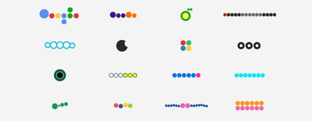
Your brain processes colour in different manners to make sense of the world around it. The physiology behind it is infinitely complex, the image in the tweet below shows one example of it in action.

We use colour to influence behaviours too; if you want people to feel at ease or relaxed, you use blues and shades of white. If you want to suggest flavours you use anything from yellow and orange (citrus) to purple (richness). Greens signify health, outdoors, ecology and agriculture and is associated with freshness. And the list goes on. Ask the creative team in Google, they trialed 41 different shades of blue before settling on the one which is used on clickable URLs, increased revenue of over $200m is attributed to this seemingly insignificant edit.
But most importantly colours trigger emotional connections and responses. The way we display colours in sequence or repetition can also change people’s moods, in an event space darkness paired with neon builds excitement or intrigue, this is tied to human exposure to blue light and urbanisation – neon is unnatural, so piques our attention.
This is also where legacy comes into effect too – some brands have managed to almost take ownership of specific colours, an incredible status to have in terms of recall. If I say red – most of you will think Coca-Cola. If I say purple – you’ll probably crave a Cadbury’s bar. If I showed you different shades of blue you’d reference them to the social media channel that aligns with them. Where some brands have tried (and lost) to claim a colour, they’ve resorted to iconography to achieve the same status – swoosh anyone?!
Try the below task from 2010 of identifying the brand when its logo is reduced to just shapes and colours.
In summary – when creating an experience, note that textures, shapes, lighting and especially tones are a vital part of the puzzle, worth as much thought as the idea generation. It’s imperative to how you want people to think, recall and ultimately feel about your brand.
-GC
The below graph from @Boutique might help if you struggled with some of the logos above.
